Document
Control
Policy & Procedure Access Redesign
Designing a clearer, more efficient way for staff to find and reference the policies that support quality care and compliance

THE PROBLEM
Staff couldn’t quickly locate the policies they needed, leading to frustration and wasted time during critical tasks.
THE SOLUTION
Reframe the tool to match how people actually thought about their work, renaming it “Policies and Procedures,” surfacing it in the main navigation, and removing friction from an everyday task.
THE IMPACT
Staff located policies nearly twice as fast, reducing frustration and time spent searching. For the organization, this improvement increased efficiency and strengthened compliance across departments.
My Role
Lead UX Designer
-
End to End Design
-
Cross-Functional Leadership
Team
UX Researchers
UX Designers
Software Engineers
Safety & Compliance Team
Hospital VP's and Execs
Nurses
Platform
Website (Internal Page)
Tools
Figma
Figjam
Miro
Airtable
Microsoft Teams
Project Timeline:
3 Months
WEEK 1- 2
RESEARCH AND DISCOVER
WEEK 3
INITIAL USER USABILITY
TESTING
WEEK 6
WIREFRAMES
WEEK 7
HIGH-FIDELITY DESIGN
AND TESTING
WEEK 11
HANDOFF TO
DEVELOPMENT
WEEK 12
QA AND
LAUNCH
RESEARCH
DEEPER LOOK INTO
THE PROBLEM
Within the organization, all policies and procedures were stored in a system called Document Control, a tool designed to manage official documents and keep policies up to date. In practice, however, many employees struggled to find it or even recognize it as the official source for policies.
COMPARATIVE ANALYSIS
To better understand these challenges, we began with a comparative analysis—looking at how other healthcare organizations structure and label their internal policy systems to identify usability gaps in our own.
Key Insight
Hospitals typically use a clear “Policies & Procedures” hub that’s easy to find from the intranet homepage.
Opportunity
Rename and reposition the system to match industry norms (e.g., “Policies & Procedures”) and place it directly on the intranet homepage for easier access and visibility.
Baseline Usability Study
To establish a baseline for the current experience, we ran an initial usability study of the Document Control system. The goal was to observe how easily employees could locate, navigate, and access policies in their everyday workflow.
Findability - 44%
Percentage of participants who could locate Document Control without assistance.
Task Completion Rate - 56%
Percentage of participants who successfully located the requested policy.
Average Satisfaction Rating - 5/10
Self-rated ease of use on a 10-point scale.
Common Failure Points
Most users struggled to find the system independently, often abandoning the task or asking others for help. Those who did locate it described the process as “confusing” and “too many steps.”
"I would have never found that on my own"
“It’s not usable when you aren’t doing it consistently"
“I don’t think Document Control is something I’d ever use"
UNDERSTANDING
THE USER
Our design process aimed to balance user accessibility with operational efficiency, keeping the following goals at the
forefront of every decision.
User Goals
Quickly find and access
policies through a clear,
intuitive interface.
Business Goals
Ensure staff can locate policies for quality, safety, and JCAHO (governing body) compliance.
Constraints
Limited to the existing
intranet framework and
policy database.
MAPPING THE
EXPERIENCE
Observation and task analysis revealed that finding a policy involved multiple confusing steps, unclear terminology, and redundant layers, leading to frustration and wasted time.
This insight shaped our redesign focus: simplify navigation and build
trust in the system’s accuracy.
Current Journey: Finding a Policy
Employees must navigate multiple unclear steps to reach the policy database.

"Unnecessary
extra page"
Improved Journey: Finding a Policy
The redesigned flow reduces clicks and uncertainty.

Impact: reduced navigation steps by 60%
and improved search accuracy.
USER PERSONAS
While journey mapping revealed where the experience broke down, understanding why it mattered meant looking closer at the people behind it. To design a solution that truly supported staff, we focused on the daily realities of those navigating hospital policies.


DESIGN: WIREFRAMING
The research and baseline usability study revealed a clear opportunity to simplify how employees find and access policies. With these insights, the next step was to reimagine the experience, starting with low-fidelity wireframes to test new information architecture, navigation patterns, and entry points for Document Control.
WHAT USERS NEEDED
1. Quick access to policies and procedures.
2. Prominent hub on the homepage.
3. Clearer and more intuitive labeling.
REFRAMING THE
NAME
Through usability testing and comparative analysis, we discovered that “Document Control” didn’t resonate with employees. Many participants didn’t associate it with policies at all, assuming it was a system for file storage or administrative use.
Key Insight
Clear language builds trust and efficiency. The name should communicate what it is, not how it’s managed.
Design Descision
100% of participants either preferred or immediately understood Policies & Procedures as the correct name, while none associated “Document Control” with finding policies.
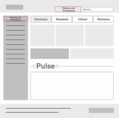
Rename Document Control → Policies & Procedures
Current Location of Document Control
Policies were stored under the "reference" tab,
which most employees overlooked.

-
45 % of employees didn’t know where to find it.
The Solution
Goal: Test two wireframe concepts to improve visibility an navigation with the new name
"Policies and Procedures"
Prototype A
Prototype B

DESIGN: Highfidelity Wireframes
BUILDING ON
INSIGHTS
-
The system was renamed to Policies & Procedures for clarity.
-
A direct homepage entry point was added for immediate visibility.
-
Search functionality and layout hierarchy were simplified to reduce steps and friction.
Prototype A

Prototype B

The high-fidelity prototype combined these elements into a cohesive design that reflected real user behavior and aligned with the organization’s visual system, making policies not only easier to find,
but easier to trust.
USABILITY TESTING
To validate our design decisions, we conducted A/B usability testing with 16 participants representing a mix of clinical, administrative, and compliance staff. Participants were asked to complete key tasks within both Prototype A and Prototype B, including:
Locate a Policy
Goal: Determine how easily employees could find the correct location for policies.
Prototype A: 10/16 Prototype B: 16/16
Identify the Correct Policy
Goal: Evaluate whether participants could locate a specific document once inside the system.
Prototype A: 9/16 Prototype B: 16/16
Verify the Policy’s Status
Goal: Test whether participants could confirm if the policy they found was current and approved.
Prototype A: 7/16
Prototype B: 15/16
Key Insight
Prototype B showed clear improvements in discoverability (94%), accuracy (89%), and confidence (83%), confirming the value of renaming and surfacing Policies & Procedures directly on the intranet homepage.
FINDINGS
Testing revealed significant improvements in both user performance and organizational efficiency after renaming and restructuring the Document Control system into the new Policies & Procedures hub.
USER IMPACT
+72%
Task success rate
55%
Faster task completion
BUSINESS
IMPACT
Improved compliance readiness:
Simplifying access reduced time spent verifying document versions, directly supporting Joint Commission (JCAHO) site visit preparation.
Higher employee adoption: Clear naming and visibility increased the likelihood of staff referencing policies independently, minimizing risk, and improving consistency
of care.
INSIGHT
By reframing language and reducing friction, the redesign didn’t just improve usability, it improved operational reliability. Employees could find what they needed faster, with fewer steps and greater trust in the information.