MY MCHS APP
Notification Experience Redesign
Designing a simpler, smarter way
for patients to stay informed
about their care

THE PROBLEM
Patients received updates through multiple disconnected channels.
THE SOLUTION
THE IMPACT
Design a centralized notification system within the mobile app, where all updates could be viewed and customized
in one place.
Patients gained real-time control over their healthcare journey while staff workload decreased through
fewer scheduling and information calls, resulting in
greater efficiency, lower costs, and a more connected
care experience.
My Role
Lead UX Designer
-
End to End Design
-
Cross-Functional Leadership
Team
UX Researchers
UX Designers
Software Engineers
Safety & Compliance Team
Nurses
Platform
Mobile App
Tools
Figma
Figjam
Miro
Airtable
Microsoft Teams
Project Timeline:
3 Months
WEEK 1- 2
RESEARCH AND DISCOVER
WEEK 3
BASELINE USABILITY
TESTING & INTERVIEWS
WEEK 6
RESEARCH ANALYSIS
WIREFRAMING
WEEK 7
TESTING
WEEK 11
HANDOFF TO
DEVELOPMENT
WEEK 12
QA AND
LAUNCH
RESEARCH: Why Notifications Came First
What Matters Most
To Users
Before deciding where to focus our design efforts, we needed to understand which features patients valued most.
To uncover these priorities, we conducted a Kano Survey with over 600 participants, asking them to rate potential app features from essential to nice-to-have.
Feature
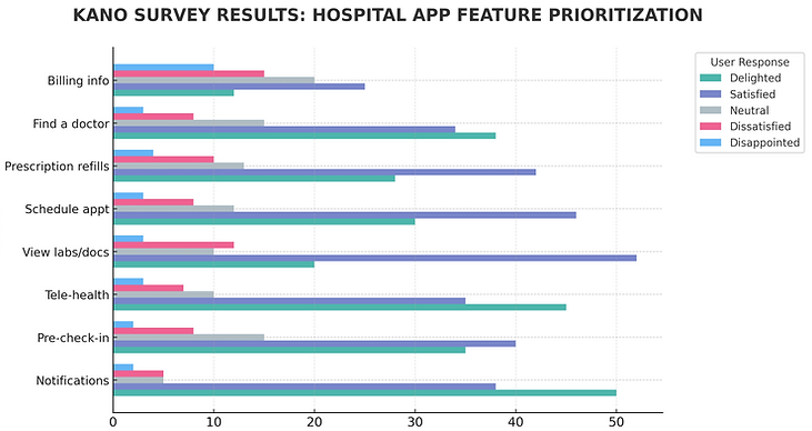
600+ Survey Participants
58% Survey Completion Rate
Percentage of Users
Research Insight
The results revealed that real-time notifications were consistently rated as a must-have feature, especially for appointments, test results, and medication updates. This finding validated our decision to make the notification system the focus of this design phase.
Expanding the
Research
Building on initial insights, we conducted focused research to understand how patients prefer to receive, manage, and personalize notifications.
Through interviews with patients, caregivers, and healthcare staff, we explored:
-
Which notification features users value most.
-
Preferred default settings and delivery methods.
-
The potential for caregiver notifications.
-
Clear terminology (e.g., “alerts” vs. “notifications”)
-
Ideal timing and frequency of messages.
THESE WERE SOME MAJOR POINTS WE WANTED TO CALL OUT REGARDING NOTIFICATIONS
Appointment reminders were the top priority
“Appointment reminders are the most important thing for me — I just don’t want to miss anything again.”
– Patient, Age 62
Test and lab results ranked second
“Getting my lab results right away would save me from constantly calling the office or checking the portal.”
– Patient, Age 45
Pharmacy updates and in-app messaging followed
“I’d love to get pharmacy updates when my prescriptions are ready instead of finding out days later.”
– Caregiver Parent, Age 38
These findings guided our rapid prototyping phase, where we focused on features like real-time alerts, notification history, and user-controlled settings to personalize the experience.

UNDERSTANDING THE USER
Designing for patient engagement required understanding a wide range of users, each with different needs and levels of digital confidence. Research revealed 3 core personas central to the experience.
.png)


By designing for this spectrum of users, we ensured the notification system was inclusive, adaptable, and effective across a variety of healthcare roles and digital literacy levels.
BREAKING DOWM THE DESIGN PROCESS
Our design process aimed to balance user accessibility with operational efficiency, keeping the following goals at the forefront of every decision.
User Goals
Create a simple, intuitive interface that could be easily understood by patients across varying ages and levels of technical comfort.
Business Goals
Reduce operational costs by automating routine staff tasks—like appointment confirmations and recovery updates—through in-app notifications instead of phone calls.
Compliance Goals
Security and privacy guided every decision, ensuring HIPAA compliance and protecting patient data while keeping the experience simple and usable.
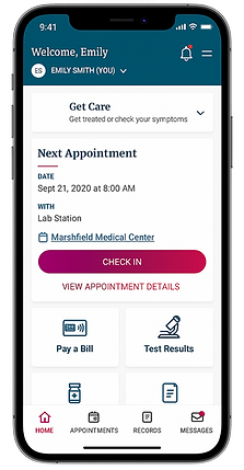
We created a seamless initial onboarding flow that introduces users to the new feauture in the app and provides a clear, intuitive option to opt in or out of notifications. This ensures transparency, reduces friction, and supports user control from the first interaction.
User Journey to Enable Notifications in the App


DESIGN: PROTOTYPE
HIGH-FIDELITY
SCREENS
With a clear understanding of our users and goals, we moved into the design phase—creating the first prototype screens to guide users through onboarding and notification setup.
1. Allowing notifications


2. Managing notifications & preferences


3. Viewing notification activity

BUILDING THE
PROTOTYPE
Testing Two Approaches to Simplify How Patients Manage Notifications
Guided by user insights and competitive analysis, we designed two prototypes to test different approaches to notification delivery and management. Each concept emphasized clarity, accessibility, and the ability for users to stay informed without feeling overwhelmed.
Notable Differences Between the Two Prototypes
PROTOTYPE A
PROTOTYPE B

No distinction for notification activity
Notification activity tab


Top by hamburger menu
Bottom navigation

Alerts are managed under Manage Notifications in the hamburger menu

Manage notifications in the Settings tab
TESTING
USABILITY TESTING
To evaluate how users interact with our new notification system, we conducted a moderated usability study with
16 participants between the ages of 40 and 81. Each participant completed five core tasks across two prototypes:

1. View notification log
Goal: Identify where users look for notifications by measuring discoverability across icons and menu locations.
Prototype A: 10/16 Prototype B: 14/16


2. Delete a notification
Goal: Observe how users delete notifications by testing recognition of the delete icon, confirmation flow, and swipe gesture expectations.
Prototype A: 12/16 Prototype B: 15/16
3. Manage notifications
Goal: Identify where users adjust notification preferences by testing discoverability of “Manage” options and clarity of menu labels and terminology.
Prototype A: 12/16 Prototype B: 15/16
4. Lock screen
Goal: Goal: Assess user comfort and privacy preferences for lock screen previews.
Prototype A: 16/16 Prototype B: 16/16

5. Menu location
Goal: Determine where users expect notifications in the app menu and their preference for bottom-nav redundancy.
Prototype A: 16/16 Prototype B: 16/16
MY MARSHFIELD APP
PROTOTYPE A
PROTOTYPE B
FINDINGS
Prototype B proved significantly more intuitive, achieving a 90% task success rate vs 73% for Prototype A and users completing tasks 32% faster on average.
Users immediately recognized the bottom-nav bell and preferred swipe-to-delete with confirmation. Most valued having a clear place to manage notifications and control privacy, validating Prototype B’s simpler, more familiar interaction pattern.